
Introduction
Location Map
Base Map
Database Schema
Conventions
GIS Analyses
Flowchart
GIS Concepts
Results
Conclusion
References
![]()
GIS Analyses
Human Control Group
Sample
Our sample for the human control group (n=11) can be characterized as a random sample of friends and classmates, roughly half women (n=5) and half men (n=6), with varying degrees of experience with GIS, remote sensing, and archaeology experience.
Initial Information
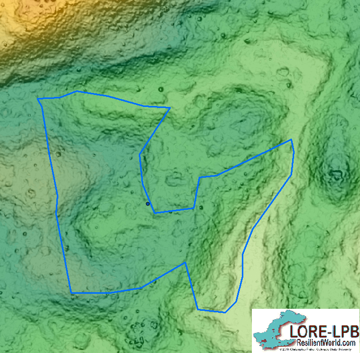
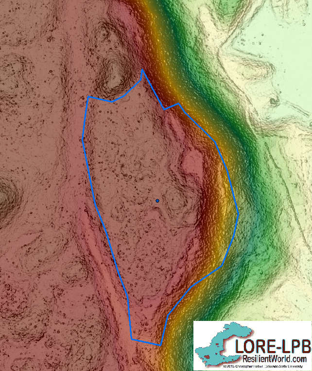
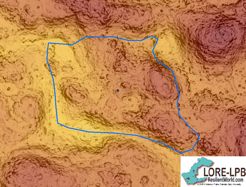
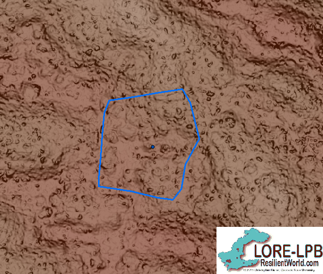
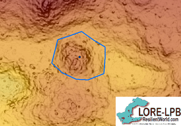
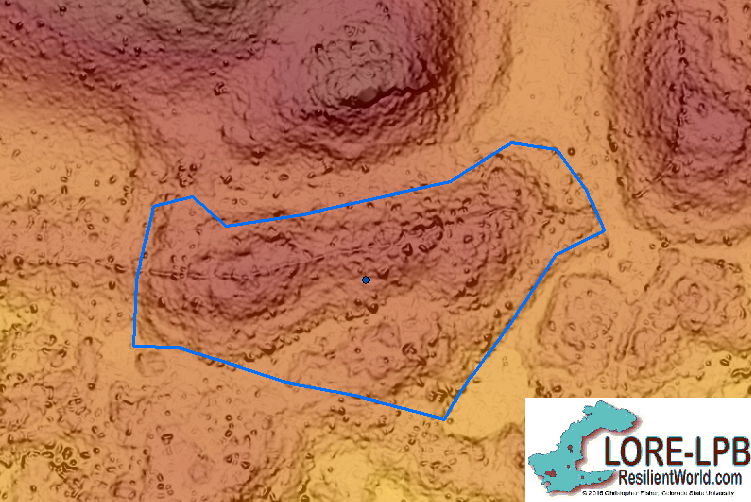
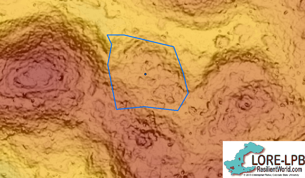
Before the participants arrived, the base map of Angamuco (composed of a composite multi-look hillshade plus the Digital Elevation Model symbolized with ESRI's Elevation #1 colors), along with the sample points and complejos, was added to ArcMap. Participants were shown the site map of Angamuco and were given a general description of what a complejo is: akin to a city block. They were allowed time to ask questions and explore the map area for other details.
The facilitator showed each participant some examples of complejos, as outlined in purple on the map. These boundaries were drawn by Dr. Chris Fisher, an archaeologist in the Anthropology department, using a mix of subjective boundary mapping and boundary mapping with ground truth data. The purple-outlined boundaries were included so the participants would have a general size and shape reference for their boundaries.
Complejos selected for the control group
Click on each thumbnail for a larger image.


Boundary Mapping
Four primary features were defined as possible clues for where to put boundaries, with the facilitator providing examples of each:
- Major topographic changes.
- Roads
- Walls
- Plazas (flat areas, gaps without structures)
The participants were again allowed to zoom in and out of examples, as well as ask questions, to gain a deeper understanding of where to put their boundaries.
In order to draw the polygons in ArcGIS, a control group number was assigned to each participant and a corresponding shapefile was added to the base map. These shapefiles served as the layer onto which each participant would draw their complejo boundaries. Ie. CG_001.shp, CG_002.shp, and so on. (See section on naming conventions for more information.)
This choice of naming convention and particular method for adding layers to the map allowed for an easier analysis of each participants boundary mapping behavior. It also provided an easy way to add and remove participant boundaries from the map and get a general understanding of the entire human control group behavior.
Once the participant was ready to start, the facilitator started an editing session, which is an option under the "Edits" tab on the toolbar ("Start" edits). Polygons were then drawn using the "Create features" option to the right of ArcToolbox. Making sure that the corresponding shapefile was chosen as the layer onto which the features would be drawn, the participant then went to the bottom of the direction box and chose "polygon" as the shape to use for boundaries. Polygons were particularly advantageous for our work because they allow for more detailed boundary lines, since more points can be dropped to make the polygon.
The participants were asked to periodically save their polygons using the "Save edits" option under the Edit tab. To delete a polygon, the participants right clicked on the polygon and hit "Delete Sketch"; otherwise each polygon was saved by right clicking on the polygon and hitting "Finish Sketch".
This process was carried out for 10 sample points on the base map and the same 10 points were used for each participant (See section on GIS Concepts for more information). These sample points served as the "centroid" point of a complejo and thus guided boundary mapping at that particular site. (After conducting the human control group, one of the sample points was thrown out because, with more recent boundary mapping and ground truthing, it was determined to not be in the center of any complejo.)
Once completed, the participants were asked to review their polygons to make sure they were satisfied with their finished sketches. In addition, many participants took this time to compare the size of their complejos with the size of the sample complejos.
Questionnaire
The participants also filled out an 8-question questionnaire about their previous experience with GIS (a class or other), remote sensing (a class or other), and archaeological data (surveying, mapping, excavating). The results of these questionnaires shows limited experience across the control group, with only 4 participants familiar with GIS, 2 with remote sensing, and 2 with archaeological data.
Quantitative Analysis
We used raster calculator to calculate the area of the polygons in the original complejo shape file, and did the same for each of the shape files generated by the control group. The union tool was then used to combine the control group shape file with the original complejo shape file, and calculate geometry was run on the union plygons to calculate their area. The attribute tables from these union polygons were then exported to Excel. Size ratio was calculated as the ratio of the area of the control group polygons to the original complejo polygons. Mean overlap was calculated as the ratio of the union area to the area of the two polygons that were combined in the union.
Multiresolution Segmentation
A series of four base rasters were produced in ArcMap that combined a digital elevation model with a simplified hillshade. The simplified hillshade was made by applyting a series of Majority and Low Pass filters to the multi-look hillshade. (See the section on GIS Concepts). Each of the four base rasters was then imported to eCognition, and iterations of the Multiresolution Segmentation algorithm were run over the image. The color parameter was typically set to 0.1, although for one raster we also ran itterations at 0.2. The comapctness parameter was held constant at 0.5, and the scale parameter was varied at intervals of 25 for each iteration.
The segmentation from each iteration was exported from eCognition and then imported back into ArcMap.
Calculate Geometry was used to calculate the area of the segments from the algorithm output, and the union tool was used to combine these segments with the original complejo layer. Size ratio and mean overlap were calculated following the method described in the previous section. To minimize error generated by sliver polygons, we used a pivot table to extract the maximum mean overlap for each unique complejo ID. This allowed us to restrict our analysis to only the segment that was the "best fit" for a given complejo. Segments from the algorighm that did not have an associated complejo in the original map were excluded. The results of this analysis from each iteration were combined into a master table for quantitative comparison.