Introduction
Location Map
Base Map
Database Schema
Conventions
GIS Analyses
Flowchart
GIS Concepts
Results
Conclusion
References
Project Results
California Overall:
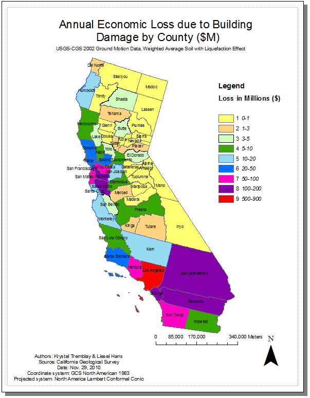
The figure above represents an estimation of future economic losses based on earthquake and demographic information prior to and including 2002. Essentially this is a simulation map termed "scenario earthquake loss" where both damage and loss expected are quantified and projected using HAZUS software. The damage and loss expected were quantified in ten counties within the San Francisco Bay Area (SFBA) and in ten counties in Southern California based on shake-maps of 50 potential earthquakes published by the United States Geological Survey (USGS). Of these 50 scenario shake-maps, 34 represent the expected ground motion hazard in the SFBA counties and 16 represent the expected ground motion hazard in the southern region.
The estimates presented above only portray ground motion-induced losses to buildings only. In other words, the losses to other elements of the built environment, such as transportation, lifeline and communication facilities are not reported here.
In summary, the areas with the lowest projected annual economic loss include counties in the northeast and mid-east areas whereas the highest loss is Los Angeles county in the southwest. Additional counties that also have a high value include those in the south as well as those clustered within the SFBA.
Source: http://www.conservation.ca.gov/cgs/rghm/loss/Pages/2005_analysis.aspx
Case Study 1: Humboldt County and Risk
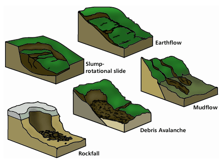
There are several fault lines that run through Humboldt County and the County contains portions of land (especially along the coast) that are especially susceptible to damage during an earthquake. It is difficult to avoid construction near these potentially volatile areas. Many cities and community sites were constructed prior to sufficient knowledge of a regions susceptibility to severe damage should an earthquake occur. Currently, two basic ways that land can be categorized are based on slope stability and liquefaction potential. Essentially, structures build on unstable land would result in damage due to the instability of the land beneath them should an earthquake's motion trigger the ground to move below. Rockslides or mudslides are possible as indicated in the pictures below. Liquefaction, as described in the intro would cause buildings to sink into the ground. The data obtained from Humboldt County characterizes these concepts as follows:
3 = High Instability
2 = Moderate Instability
1 = Low Instability
Y= Areas of Potential Liquefaction
Source: http://www.heritage.nf.ca/environment/slope.html
A common issue with GIS data is lack of complete information and coverage. We were able to locate information for the Humboldt Bay area and some other more rural areas of the County. Thus the results of our analysis are not the entire story, but a first step toward identifying communities that are at a higher risk for damage during an earthquake. We identified the total areas of cities that were in each of the listed zones (above). The areas outside of any of the zones may be relatively stable, or more information needs to be collected.
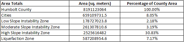
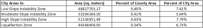
From these tables and the maps below, it is clear that small portions of the city areas are on instable ground. However, given our data we're not sure what type of structures are in the areas that are characterized as ubstable.
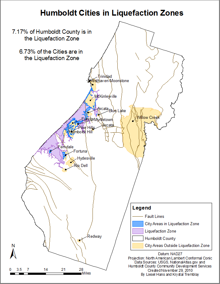
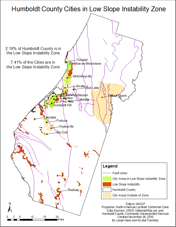
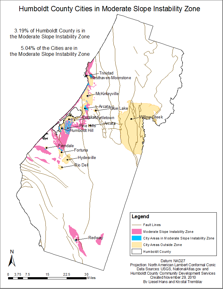
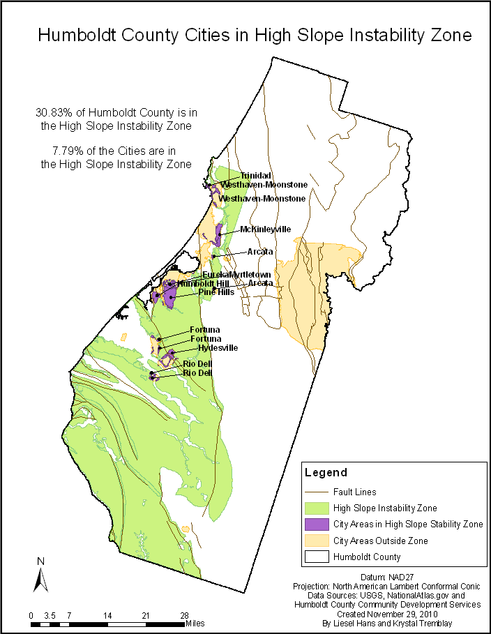
Though much of Humboldt county is characterized as being in the High Slope Instability Zone, a small portion of the city areas are. Thus we can conclude that even if an earthquake were to occur, there may not be much damage in developed areas.
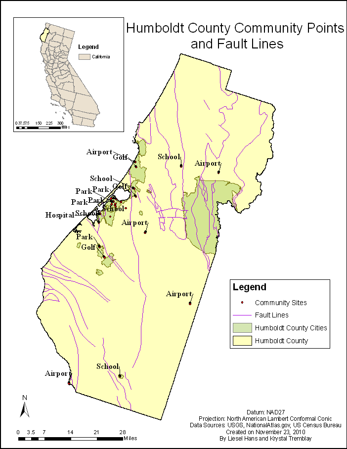
Additionally, we looked at the number of community points within these zones. We also calculated the distance from community sites like parks, golf courses, airports, schools, and hospitals to the nearest fault line. Note, of a total of 27 points there was only one point, the Freshwater Elementary School, which fell into two zones: High Slope Instability and Liquefaction.
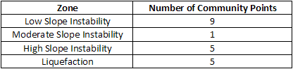
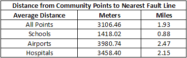
We see that the community points are quite close to fault lines, and while some are in the High Slope Instability and Liquefaction zones, there are more in the Low Slope Instability zone, and some more not in any zone ( 8 points). This is limited data, so this does not take into account the other types of structures that may be in these hazardous zones. It would be a good next step to look at these zones in conjunction with land use to really determine which areas are at the most risk for damage during an earthquake, and thus who might want to take precautions for the future.
Case Study 2: Bay Area and Fault Zones
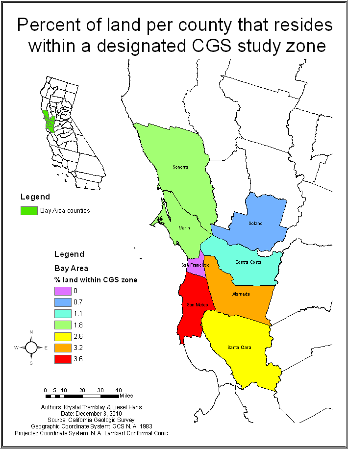
The map dictates the percentage of acres within each county that reside within a fault zone study area. The highest percentage is San Mateo at 3.6% ranging down to San Fransisco count at 0%. These CGS (California Geological Survey) fault zones are the result of a zoning act that was constructed after a devastating earthquake that occurred in 1971 in San Fernando.
In 1972 The Alquist-Priolo Earthquake Fault Zoning Act was created to moderate stucture failures occuring as a result of surface faulting in hazardous zones. The main purpose is to prevent the construction used for human occupancy on the surface trace of active faults. Essentially, before any project is permitted a State Geologist must establish regulatory zones (called Earthquake Fault Zones) around the surface trace of active faults and to investigate whether proposed buildings are being across fault (study) zones.
Source: http://www.consrv.ca.gov/cgs/rghm/ap/Pages/index.aspx
Case Study 3: Central California and Shakemaps
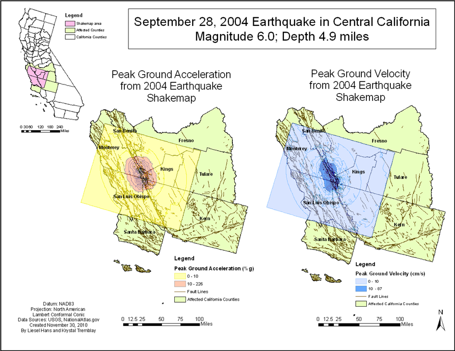
The Earthquake that occurred on September 28, 2004 wasnt entirely a surprise. The magnitude 6.0 quake with an epicenter near Parkfield, California in Monterey County, provided researchers with volumes of data as part of an ongoing project that began in 1985 called The Parkfield, California Earthquake Experiment. The USGS-based researchs purpose is to better understand the physics of earthquakes - what actually happens on the fault and in the surrounding region before, during and after an earthquake. Ultimately, scientists hope to better understand the earthquake process and, if possible, to provide a scientific basis for earthquake prediction.
Earthquakes around magnitude 6 have occurred on the Parkfield, CA section of the San Andreas Fault at what appears to be somewhat regular intervals: 1857, 1881, 1901, 1922, 1934, and 1966. Given the unique ability of researchers to essentially know where and roughly when these moderately sized earthquakes will occur, they have set up a densely placed series of scientific instruments to capture data thoroughly. New data from the 2004 Parkfield earthquake provide important lessons about earthquake processes, prediction, and the hazards assessments that underlie building codes and mitigation policies.
This information and more can be located at: http://earthquake.usgs.gov/research/parkfield/index.php
We chose two layers of the shakemap data as examples of how to estimate damage areas: peak ground acceleration and peak ground velocity.
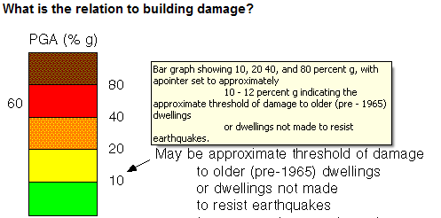
Peak ground acceleration (PGA) is measured in terms of ‘g’, the acceleration due to gravity. PGA is often reported as either a decimal: 0.34g, or as a percentage: 34% of g. While there are many factors that go into the level of structure damage resulting from an earthquake, PGA can give a rough indicator. The USGS suggests that a 10% PGA may be a threshold of damage to older buildings not designed and constructed with earthquakes in mind. Some buildings constructed with California earthquake standards, “have experienced severe shaking (60% g) with only chimney damage and damage to contents”. Those in areas with a higher risk for earthquakes should look into retrofit measures to reduce the susceptibility of structures to damage. Their suggestions include:
1. Bolt house to foundation
2. Provide resistant paneling or bracing to cripple walls
3. Reinforce brick chimneys or replace with patent metal chimneys
Source: http://eqint.cr.usgs.gov/parm.php
Kostadinov and Towhata’s 2002 research suggests that in areas where liquefaction is possible, earthquakes with peak ground velocity (PGV) greater than 10cm/sec are likely to result in liquefaction. Some suggest that PGV may be a better indicator of severe damage and damage to flexible structures.
Source: M.V. Kostadinov, and I. Towhata (2002) . Assessment of liquefaction-inducing peak ground velocity and frequency of horizontal ground shaking at onset of phenomenon. Soil Dynamics and Earthquake Engineering. 22: 309-322.
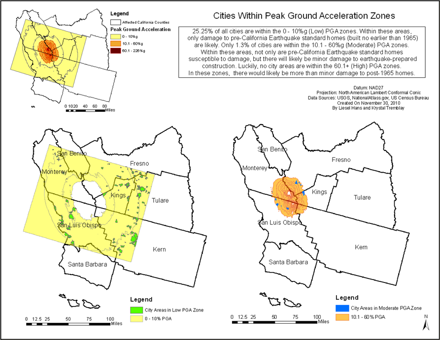
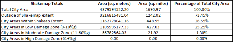
This first map shows the extent of the shakemap layers, overlapping eight counties in Central California. As explained above, PGA is first classified into two groups: lower than 10%g indicates that there was likely no damage, whereas beyond 10%g, there was likely damage in at least pre-earthquake building standard structures. PGV is classified into two groups as well: above 10cm/sec is the threshold for then liquefaction is likely to occur in the event of an earthquake.
This second map breaks down PGA even further. As discussing above 60%g is suggested to be a threshold beyond which there could be considerable damage even in earthquake-standard structures. Luckily, no city areas are within this PGA, though there are likely some structures in the area that were affected. However, this is still a good way of determining the areas where older homes out to look into retrofit opportunities or invest in earthquake insurance.
The following scale in terms of PGA and PGV (second and third columns respectively) along side the Modified Mercalli Intensity Scale. This is to give another illustration of the predicted effects of an earthquake.
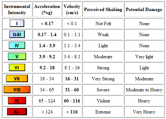 Source:http://www.cisn.org/shakemap/nc/shake/about.html#accmaps
The Modified Mercalli Intensity Scale is the scale used by the State of California to characterize earthquakes, the severity of shaking that probably occurs, and what is likely to be felt by persons within range. An illustrated version is provided here:
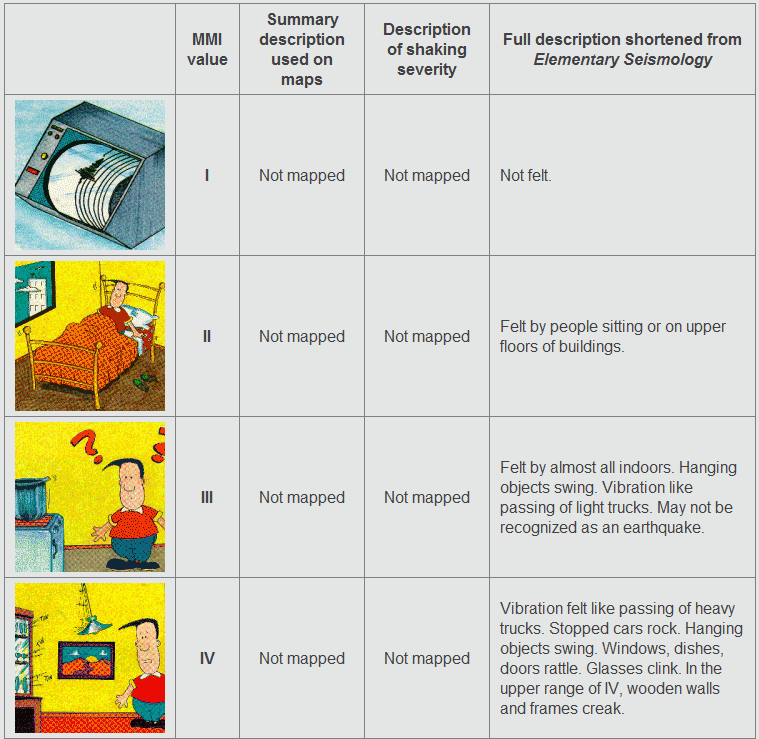
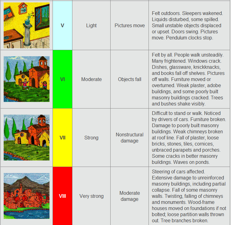
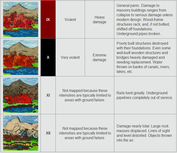
Source: http://quake.abag.ca.gov/shaking/mmi/
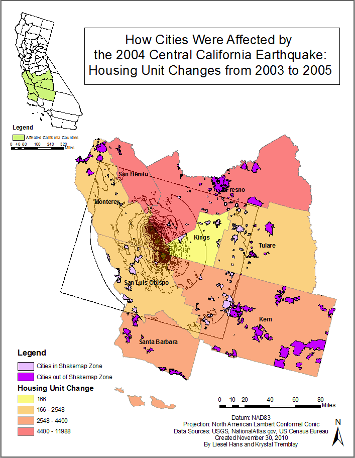
Our final analysis of the Shakemap area investigated the Housing Unit changes from 2003 (before the earthquake) and 2005 (after the earthquake). While Housing Unit counts increased in every county affected by the 2004 earthquake, there were some disparities which may have resulted for a variety of reasons. While we expected the number of housing units to perhaps decrease over the years due to damage, it is likely more possible that the numbers show that any damage was not severe enough to wipe out an entire house. We have already seen with teh PGA map and resulting table that most city areas were not at risk of great damage. Housing units are not a good measure of earthquake damage, though you may be able to use this data if the earthquake is quite severe and impacts large populated areas. In the future it would be interesting to related shakemap risk-assessment zoning for a given earthquake with the related earthquake insurance claims for that area. Despite California's reputation, many citizens do not have earthquake insurance, so this data will likely take several years to develop sufficiently for research use.
Last Modified December 7, 2010.