Introduction
Location Map
Base Map
Database Schema
Conventions
GIS Analyses
Flowchart
GIS Concepts
Results
Conclusion
References
GIS Concepts
Projection
Our world is three dimensional, yet we must find a way to make it two-dimensional for traditional use within ArcGIS. We use projections to take a 3D object (the Earth) and make it into a flat map. For this specific case we chose to use the Lamber Conformal Conic projection, which is a conic projection based on two standard parallels:
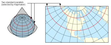
This projection is a good choice if your specific location is, like California, within the middle latitudes because distorition is the lowest in the band between the standard parallels.
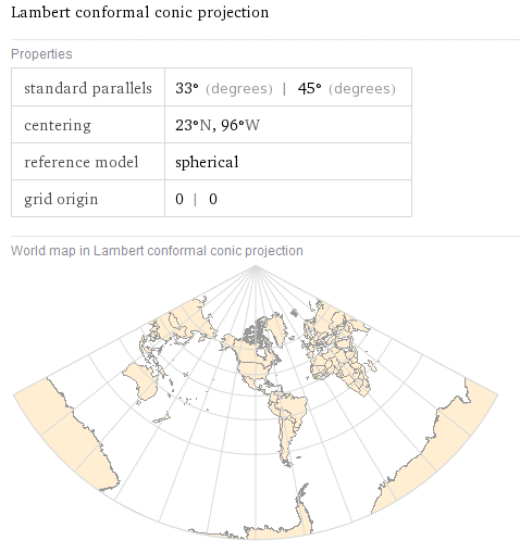
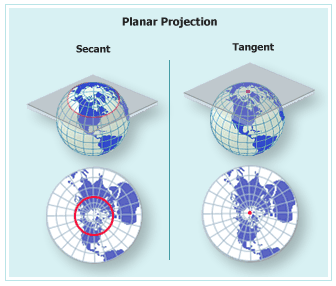
All projections must distort in some manner, due to the nature of trying to represent a 3D object as 2D. North American Lambert Conformal Conic is a good choice for our locational area of California, while a projection like planar would not be a good choice for California. The further from the point of tangency, the greater the distortion.
Sources: ERSI ArcGIS Desktop Help, Wolfram Alpha and NationalAtlas.gov
For data that needed to be defined, in ArcCatalog you would Select Define Projection from the Toolbox:
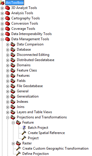
The prompt box for Define Projection looks like:
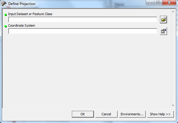
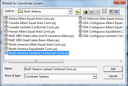
You can select your projection, or import it from a layer that has a projection you know you want this new data to match. We chose North American Lambert Conformal Conic Projection.
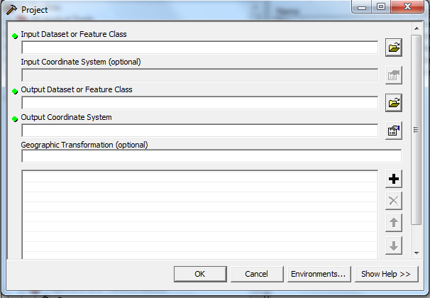
If your data already has been projected when you obtained it, you have the opportunity to reproject it through the same Toolbox (Data Management/Projections and Transformations/Feature/Project). The prompt box for this options looks like:
Note that while our discussion of GIS concepts revolves around projections, there are equally as many important issues surroung Geographic Coordinates. Our data was always pre-defined in geographic coordinates, but often with data such as field data collected via GPS, defining the geographic coordinates can be a cumbersome undertaking. Vist another 2010 project to learn more about these issues or consult ArcGIS Help Online.
Metadata
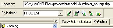
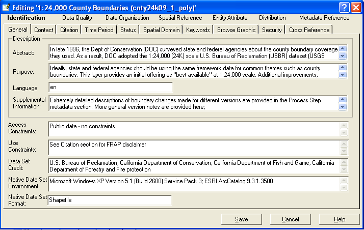
Metadata is essentially data about your data. This is important not only to keep your own work organized and to create an informative and responsible map, but for anyone who needs information about your data. A bunch of points means nothing if you don't know what they mean spatially, what the information in the attribute table means, how old and thus how relevant the data is, etc. Metadata sometimes is nicely linked to the actual data so that when you open it in ArcCatalog, the metadata will alreay be there. Sometime the information only comes in a text file or is listed on the website you got your data from. In these situations you must input the metadata yourself. Though you must input and edit metadata in ArcCatalog, you may reference some of the information in ArcMap. To input/edit metadata, select your single data file and click on the tab labeled "Metadata". You will notice that the toolbar directly above these tabs will be activated. The left icon (with the pencil) titled "Edit Metadata" allows you to edit the existing metadata:
The metadata editing window that will pop up looks like:
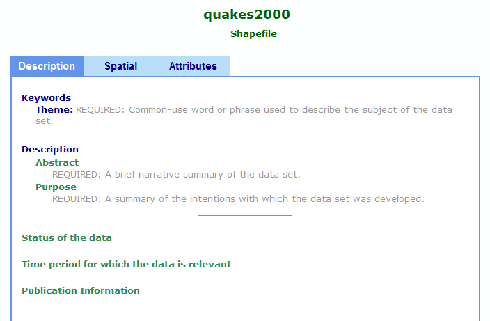
As mentioned, sometimes your data will not have any metadata associated with it when you open it in ArcCatalog:
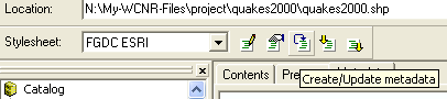
In this case, you can either go about inputing metadata through the "Edit Metadata" icon, or alternatively you can click on the middle icon in the toolbar titled "Create/Update Metadata":
Sources: ERSI ArcGIS Desktop Help
Geodatabases:
A geodatabase is a collection of geographic datasets within a common file system folder. There are three types of geodatabases: file geodatabase, personal geodatabase and ArcSDE geodatabase. For this project we used a file geodatabase as it is the "recommended native data format for ArcGIS stored and managed in a file system folder". A personal geodatabase can be used for a smaller projects (up to 2MB) and is tied to the Windows operating system. A file geodatabase can contain up to 1T of information and can be used in platforms other than Windows if need be.
Within the geodatabase, there are datasets (feature class, raster, and tables) to maintain organization of your information. For our studies, we only employed feature class datasets and tables. We chose to organize our data by case study regions. For example a specific shapefile of the Humboldt County Liquefaction Zones would be within the Humboldt dataset, while a shapefile of all California Counties would be in the general California folder since it is used in all three study areas. See the Database Schema for a visual.
Feature Class:
A feature class is a homogenous collection of common features. We used feature class datasets to effectively organize data within the geodatabase - this makes it easier to locate the file you need for a map or analysis.
Importing Feature Classes:
Data is collected fomr a variety of sources and new layers are created throughout the data preparation and analyses processes. To organize the data into feature class datasets, you can drag-and-drop a file if it is already in the geodatabase, or you may need to import the feature class.
Creating a New Layer:
For example, from the California county shapefile, we created a new layer (and exported the data to create a new shapefile) of only the counties in the Bay Area.
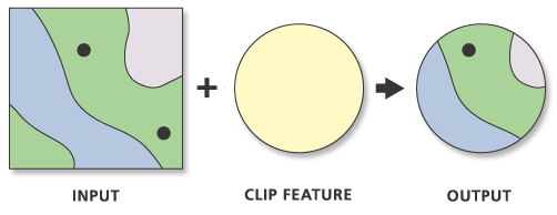
Clip:
The Clip function, located within the Analysis Tools, is used to clip features to a given boundary. The output will be a new layer that maintains the attributes of the input features. While the input feature may be point, line or polygon, the clip feature must be a polygon. For example, we clipped the shapefile containing all California fault lines so that it matched the extent of Humboldt County.
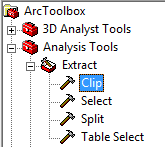
The Clip tool can be found within the ArcToolbox:
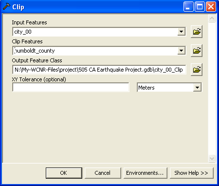
The prompt box for this function looks like:
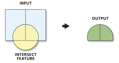
Intersect:
The Intersect function resides in the Analysis toolbox. Portions of features which overlap in all input features will be written to the final output feature class. This tool is similar to the Clip tool. For example, in order to get a new feature class of only the cities within Humboldt County, one can either clip the California cities layer to the extent of the Humboldt county layer, OR, take the intersection of California cities layer with Humboldt county. You can get the same output feature class from these operations as long as you take care with which feature class is your input. If you did the interect and had the county layer as your initial input, the resulting table will only have the attributes associated with the county, not the cities. For our purposes we often used Clip instead of Intersect.
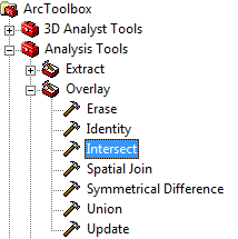
This function can be found within the Overlay subcategory of the Analysis Tools:
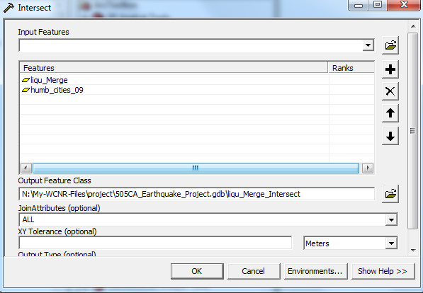
The prompt box looks like:
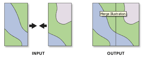
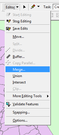
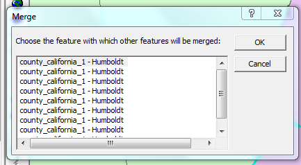
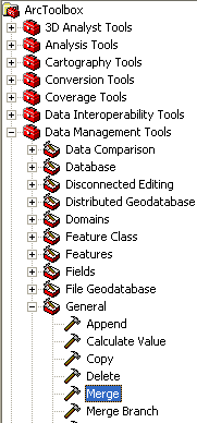
Merge:
Merge is a way of combining features of the same data type into a single new feature class. Input sources can be point, line, or polygons (or tables).
This can be done through the Editor Toolbar: View->Toolbars->Editor, Then Select 'Start Editing'. Finally.inally, select 'Merge'. Then select the polygons you wish to merge into one.
Merge can also be done through the ArcToolbox:
The prompt box for this function looks like:
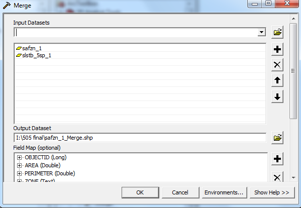
One example of our need to 'Merge' data: Our original California county shapefile often had several polygons associated with one county. This was often the case for county's containing islands, for example. In order to more effectively perform our analyses we needed to merge these polygons together so that each County consisted of one polygon.
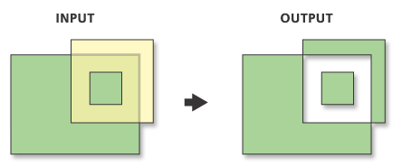
Symmetrial Difference:
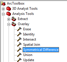
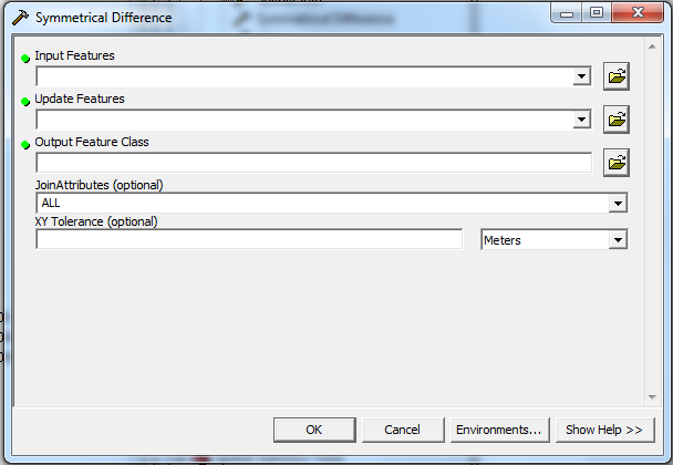
The Symmetrical Difference function resides in the Analysis Toolbox and is a type of intersection. Essentially, the portions of the input features which do not overlap will be written into the final output feature class that results from this operation. For example, we used this function to separate out the city areas which were not within the extent of the Shakemap.
This function can be found within the Overlay subcategory of Analysis Tools:
The prompt box looks like:
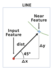
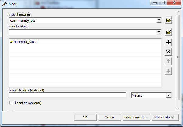
Near:
The Near function resides in the Analysis Toolbox and determines the distance from each point in your selected input features to the nearest line (or point) in the selected "Near" features. The output in a new field within the input feature attribute table which lists the computed distance for each point. An option is to set a search radius, which will set an output distance of "-1" if the nearest feature is outside of the search radius. A distance value of zero will appear if the two features intersect, thus this is one means of seeing if points intersect with other points or polylines. One caveat to the Near function is that if you have already calculated a Near distance from the input feature to another feature, the new Near distance calculation will replace the existing one. You need to export the data if you wish to save the old calculations.
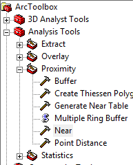
The Near function is found within the Proximity subcategory of Analysis Tools:
The prompt box for this function looks like:
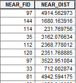
The results, as mentioned, will be in the attribute table of your input feature class:
Attribute Table:
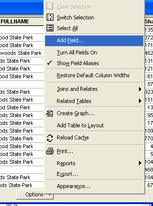
New Field:
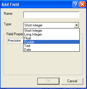
Some attribute table editing may be done without the Editor Toolbar. You can create a new field within the attribute table by slecting "Add Field" from the Options drop-down menu.
You are prompted to name the Field and adjust settings from the defaults (if desired). The new field will appear at the end of the attribute table and there will be "<Null>" entries for each row.
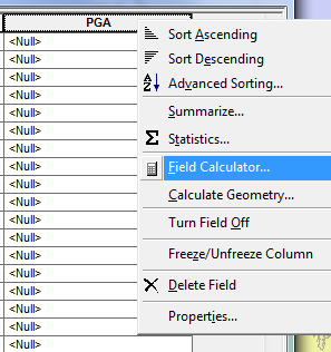
Field Calculator:
Once you have created a new field, you may calculate the values with the Field Calcluator. Your calculation can be as simple as setting each value to zero, or can involve complicated mathematical calculations using values in other fields in the attribute table.
The prompt box for this operation looks like:
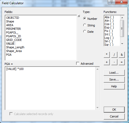
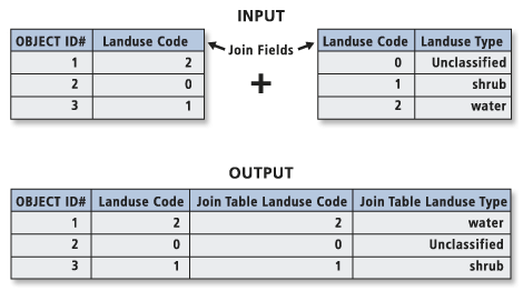
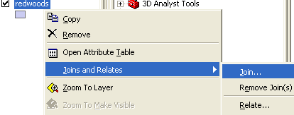
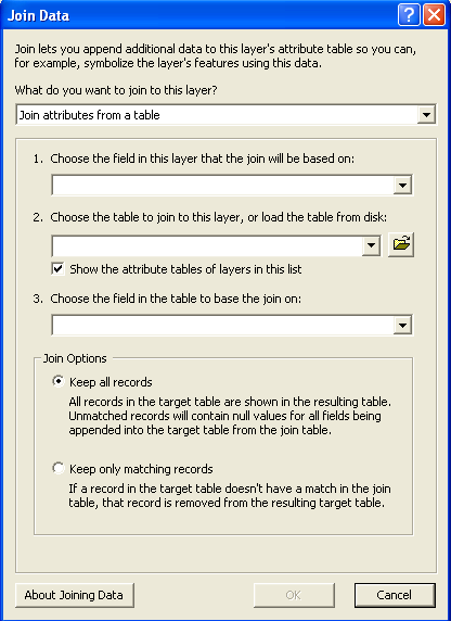
Table Join:
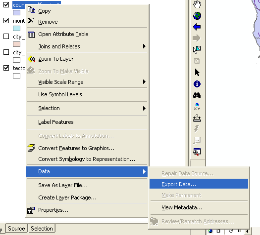
You may join additional information into an attribute table through thte 'Joins' function. The records in the input layer (or table) are matched to the records in the join table based on a common field (set via the 'join field' and the 'input field'). More than one join can be performed on a layer, and may be removed at any time. The join only lasts for the duration of your working session, but to make the join permanent, you can either use the 'Save Layer to File' tool, or export the data as described above.
This operation can be found by right clicking on a specific layer, the selecting join:
The prompt box will look like:
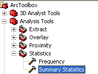
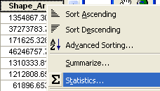
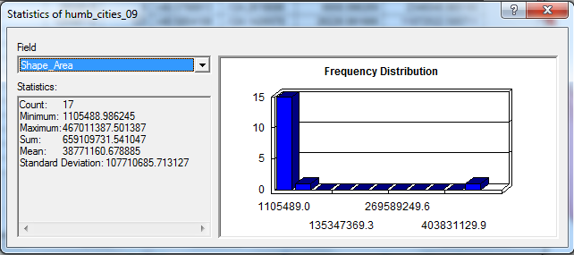
Summary Statistics:
Summary Statistics can be calculated for any field in an attribute table. This can be done through the Analysis Toolbox, or within the attribute table itself. The following statistical operations are possible: Sum, Mean, Maximum, Minimum, Range, Standard Deviation, First, and Last. To get this information through the attribute table, simple right-click on a specific field heading and then select 'Statistics'. For example, we used the summary statistics to calculate percentages of city areas within slope instability and liquefaction zones.
To access Summary Statistics information through the Analysis Toolbox (output will be a new table):
To access Summary Statistics information through the Attribute Table:
For this access method, the output will look like:
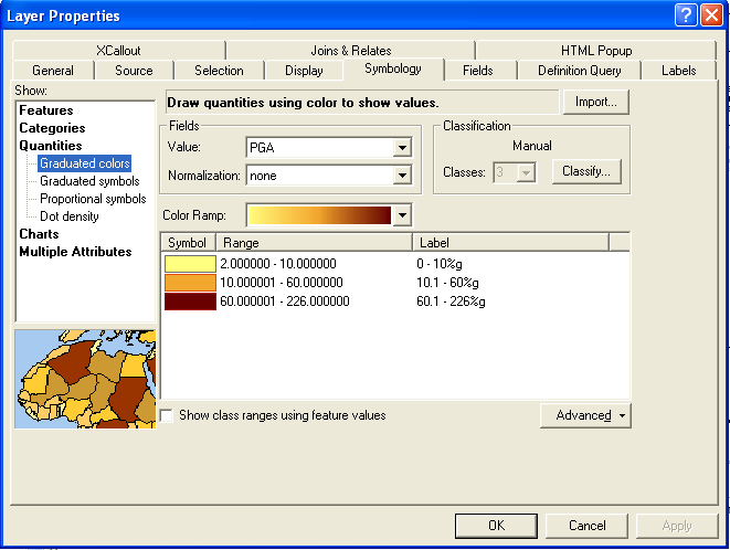
Classifying:
You can classify your data based on the values in a specified field to visualize these values in an easy to read manner. For example, during election coverage, the media often provide maps indicating 'Red' and 'Blue' states as a means of indicating the majority of Democratic or Republican voters in a given state. One way we used data classification is to indicate the levels of economic damage associated with each California county. See the first map on the Results page. You can employ a preset standard classification scheme or you may customize your own based on ranges you specify.
We employed each of these GIS concepts in our analyses to reach our final results.
Last Modified December 7, 2010.